Brand Sheet · KOB-BS-01 · 2025 / 2026
La Dolce
Vita à
Mogador
The festival takes place at the Médiathèque d'Essaouira, an Atlantic city in Morocco — formerly Portuguese Mogador, today a place where Berber, Arab, Jewish, French and Mediterranean cultures coexist.
The Association La Dolce Vita à Mogador did not want an Italian festival on tour, nor a Moroccan festival hosting Italy. They wanted a third place: a dialogue between two cinematographies and two cultures, hosted in a city that has practiced coexistence for centuries.
The name says it in French, the language of exchange: Rencontres. Encounters.
Scroll horizontally →
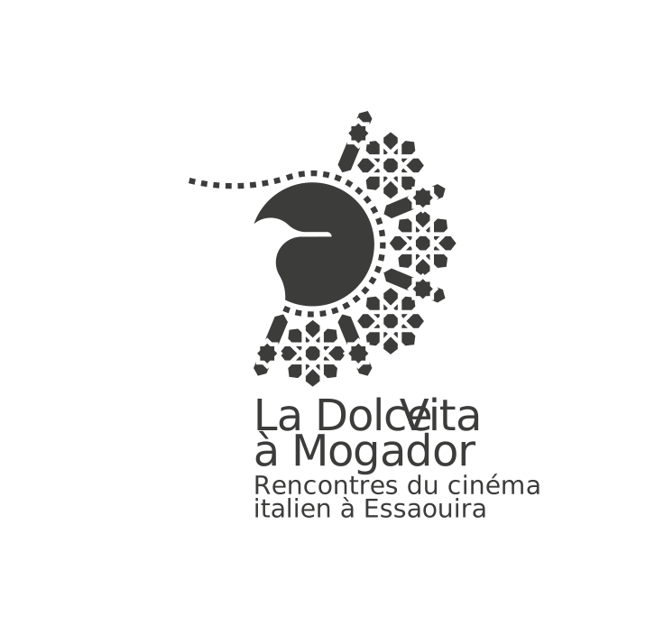
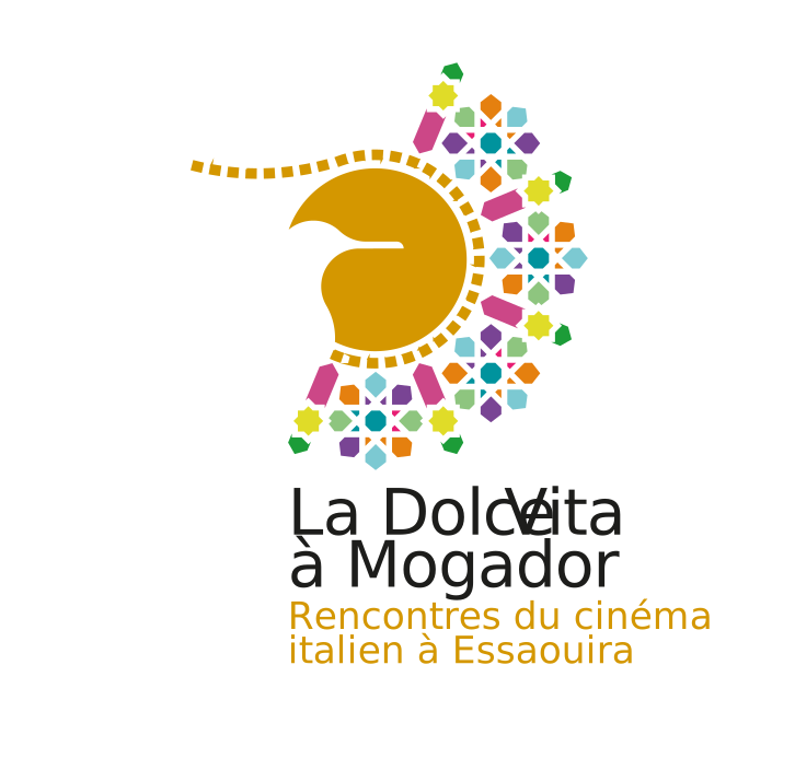
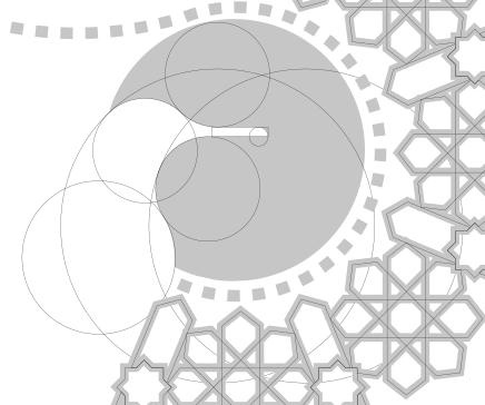
The mark works on three overlapping levels. The seagull profile in golden ochre — the mouette, symbol of Essaouira, already the sign of the first edition: continuity, not refoundation.
The dotted circle is both the Essaouira sun at sunset and the perforated edge of 35mm film. The city becoming a frame.
The polychrome zellige mosaic, with eight-pointed stars, extends beyond the circle: Islamic sacred geometry and the chromatic field of a film projector. Three planes — place, cinema, geometry of the country. None is quotation. Each is structure.
The festival lives in French (main language of institutional Morocco and the Médiathèque), Italian (language of the festival and films), Arabic (language of the country). Three alphabets, three reading directions — Arabic is written right to left — three typographic traditions.
Those who approach the problem as technical look for a way to make them coexist without mutual interference. Those who experience it as cultural understand that their coexistence without hierarchies is the political statement of the festival.
There is no primary language and two translations: there are three contemporary languages. Every reader finds their own as the first language. And that is exactly what the festival wants to be.
Click on a swatch to copy the HEX.
CMYK and Pantone (PMS) values calculated as approximations from RGB.
The relationship with the festival has been continuous for three editions. Across that span the studio has handled the entire communication, every year, with a visual system that varies without repeating itself: brand identity, multilingual website, posters, programme booklet, invitations, signage at the Médiathèque, room set-ups.
Video idents, social content with an editorial plan and daily coverage during the festival, materials for institutional partners. Social, web and video production are carried out in collaboration with La Balena Comunica, the studio's technical and creative partner.
Designing a festival's identity in year one is an act of brand identity. Looking after it for three consecutive editions is something else: it is the life of the project.
Scroll horizontally →


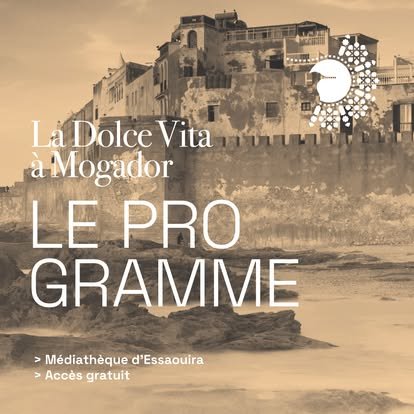
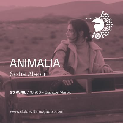
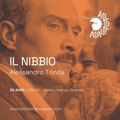
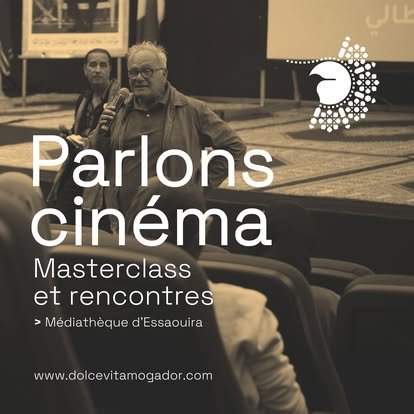
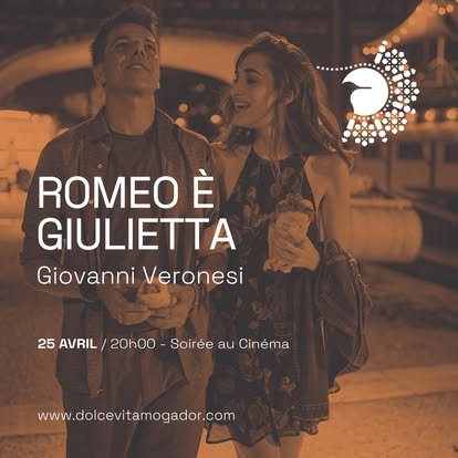
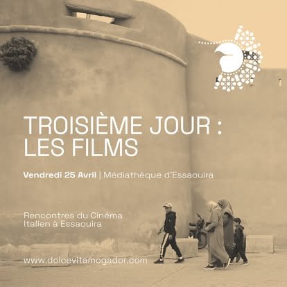
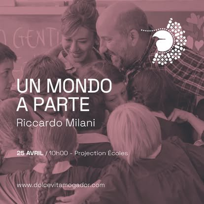
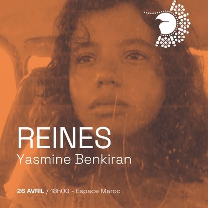
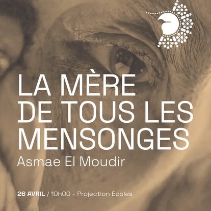
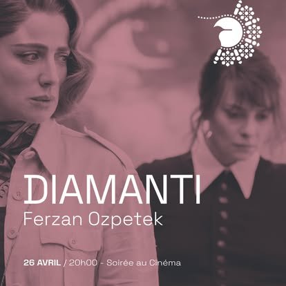
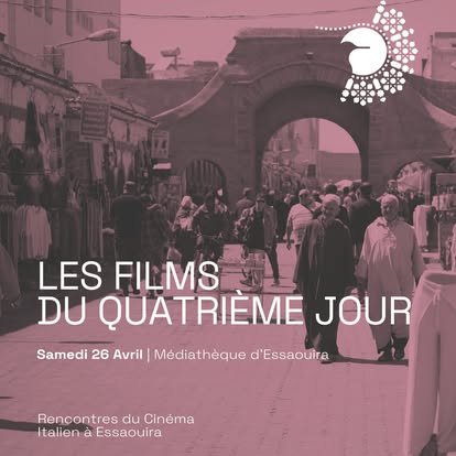
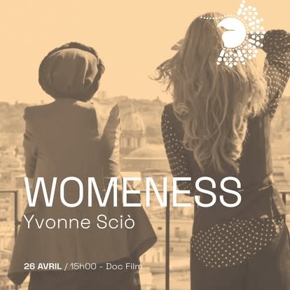
The 2025 social calendar tested the system on quantity. Every post is built on the same compositional grid: mark top right, full-bleed image toned in monochrome, typographic block bottom left with title, author, date, place. The system holds because it is grammar, not template.
The monochrome toning — alternated across the three fundamental palette tints: gold/sepia (the stone of Essaouira at sunset), ochre orange (the mark's calligraphy), mauve/dusty pink (the inner tones of the zellige) — is the device holding together twelve very different source images.
The chromatic continuity makes the series feel like a single editorial object, even when the audience encounters it across different feeds, different days, surrounded by other content.
2025 edition · Instagram + Facebook + LinkedIn
The Mediterranean that Kind of Blue represents — a Naples that looks south and east, not only north — is a professional position that few Italian studios occupy. The dialogue with the Maghreb is not an exotic exercise but a cultural continuity: for Naples, North Africa has always been a natural direction of gaze, even before becoming a professional one.
La Dolce Vita à Mogador is the case that declares it openly. It opens a direction of work: festivals, residencies, cultural cooperation programmes, place-identities for institutions working on the Italo-Mediterranean axis. A ground the studio frequents by affinity, not by opportunity.