Brand Sheet · KOB-BS-03 · 2026
BOP.
Beats of
Pompeii
BOP — Beats of Pompeii is a unitary festival, produced and curated by Blackstar Entertainment of Naples, calling thirteen different artists to the Anfiteatro degli Scavi di Pompei over the course of one summer.
In the 2026 edition we go from the international pop of Of Monsters and Men and Charlie Puth to the jazz of Pat Metheny, from the symphonic Riccardo Muti to the songwriting of Vinicio Capossela.
Each artist, however, arrives with their own tour: their own stop-producer, their own official images, their own sponsorships. The client is one: Blackstar. The visual voices to hold together are many.
Scroll horizontally · nine tours, one signature of place


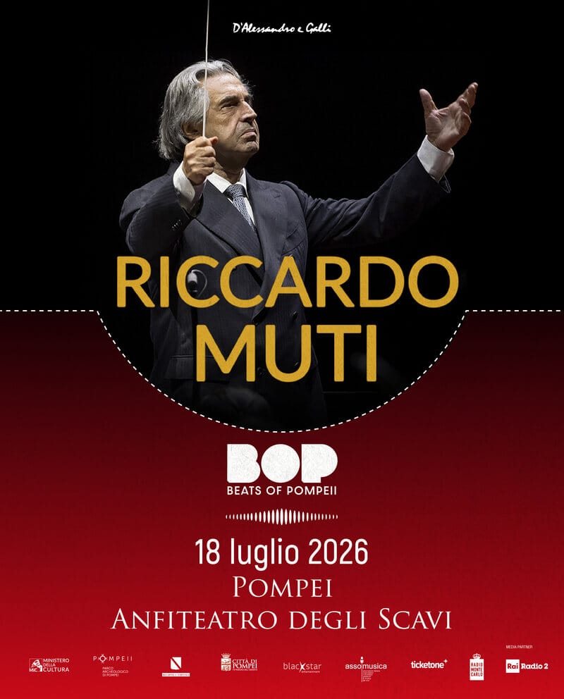
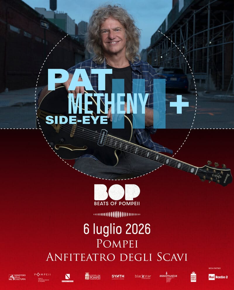
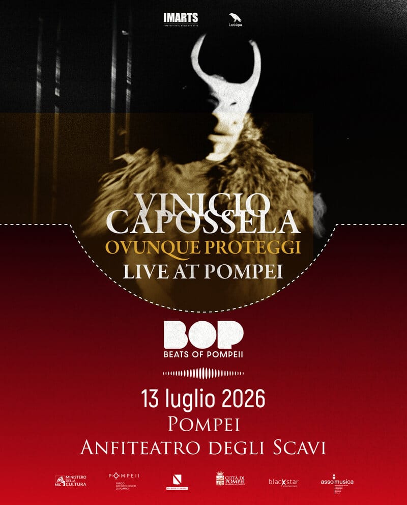
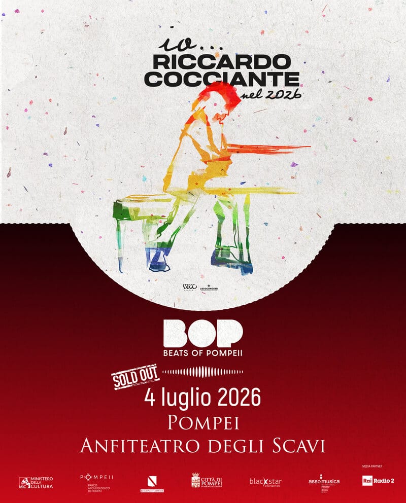


Thirteen concerts by thirteen artists mean thirteen different photographs, thirteen different palettes, thirteen different typographic registers. Pat Metheny presents in an American urban image; Riccardo Muti in a solemn portrait; Of Monsters and Men in a punk-pop collage.
Our responsibility: to transform the festival's venue — the Anfiteatro degli Scavi di Pompei — from a mere location into an editorial signature. The unity of the programme could not come from the artists, too different from each other. It had to come from the place.
Pompeii as signature, not as address.
Preview with visual substitutes · actual fonts are Trajan (Adobe) and Akrobat (Fontfabric), awaiting self-hosting
The first gesture: isolate the shape of the Anfiteatro degli Scavi and bring it into the visual system as an editorial sign. Every poster is crossed by a dashed white half-moon — a plan section of the arena — that cuts through the composition.
The second gesture: the choice of chroma. The Pompeian red is not a generic stage-set red, but the specific colour of the Anfiteatro's artefacts: warm, earthy, deep. All posters carry this chroma in the lower half of the composition.
The third gesture: the grammar of the poster, identical for every artist. In the upper half the official image, kept in its original aesthetic; the half-moon that cuts; in the lower half, Pompeian red with logo, sound-wave, date, venue.
Click on a swatch to copy the HEX.
Dominant palette extracted from the festival posters: near-absolute black, Pompeian red (specific colour of the Anfiteatro's artefacts), deep bordeaux, paper white. CMYK and Pantone calculated as approximations from RGB values.
The festival's unified billboard lines up the thirteen dates in a single composition. It's not the summary of the posters: it's the higher-rank poster, the one the public sees on the underground, at the entrance of the Anfiteatro, on the urban billboards of the province.
The compositional logic is identical to the single poster but scaled to seriality: the half-moon that crosses, the Pompeian red band in the lower part, the thirteen artists set into a typographic grid that aligns them without flattening them.
The social calendar — Instagram, Facebook and partner channels — was declined into 1:1 and 4:5 adaptations starting from the same visual family.
1:1 adaptations for Instagram, Facebook and partner channels · 2026 editorial plan
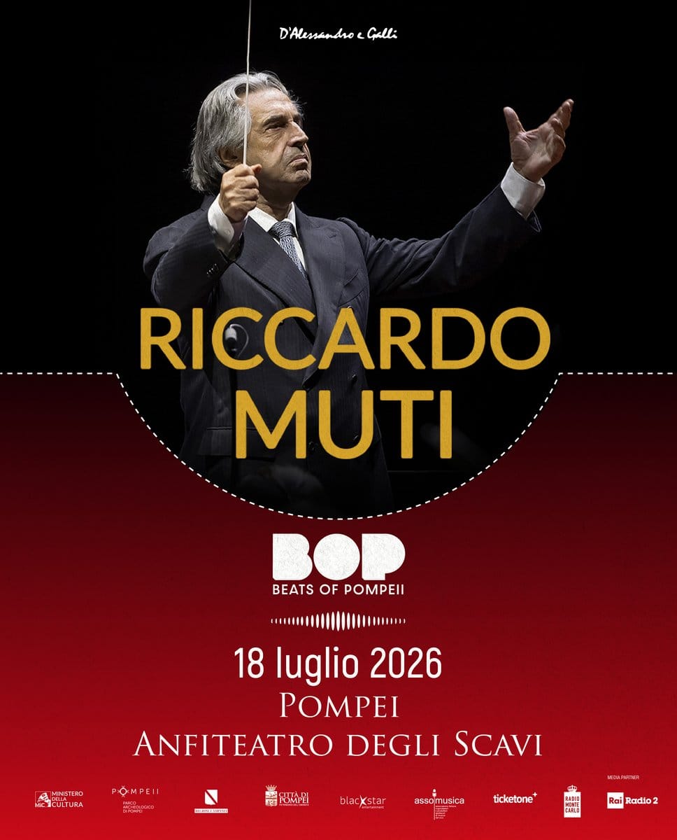


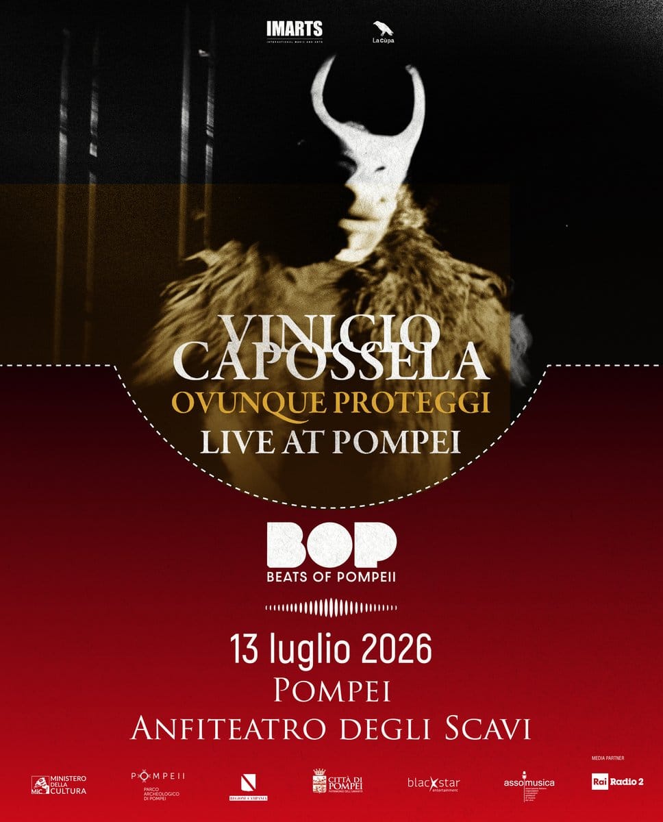
When a programme is too heterogeneous to find unity in its content, unity can come from the container. In BOP coherence does not come from a typographic grid imposed on the artists, but from having transformed the venue into an editorial signature.
The Pompeian red and the arena's half-moon don't decorate: they structure. Every poster, whatever the artist, first declares «this happens in Pompeii».
A second, complementary lesson: when a client already has a rooted mark — like the BOP mark — the first job is not to touch it. The second is to build around it a world that makes it more powerful without betraying it.